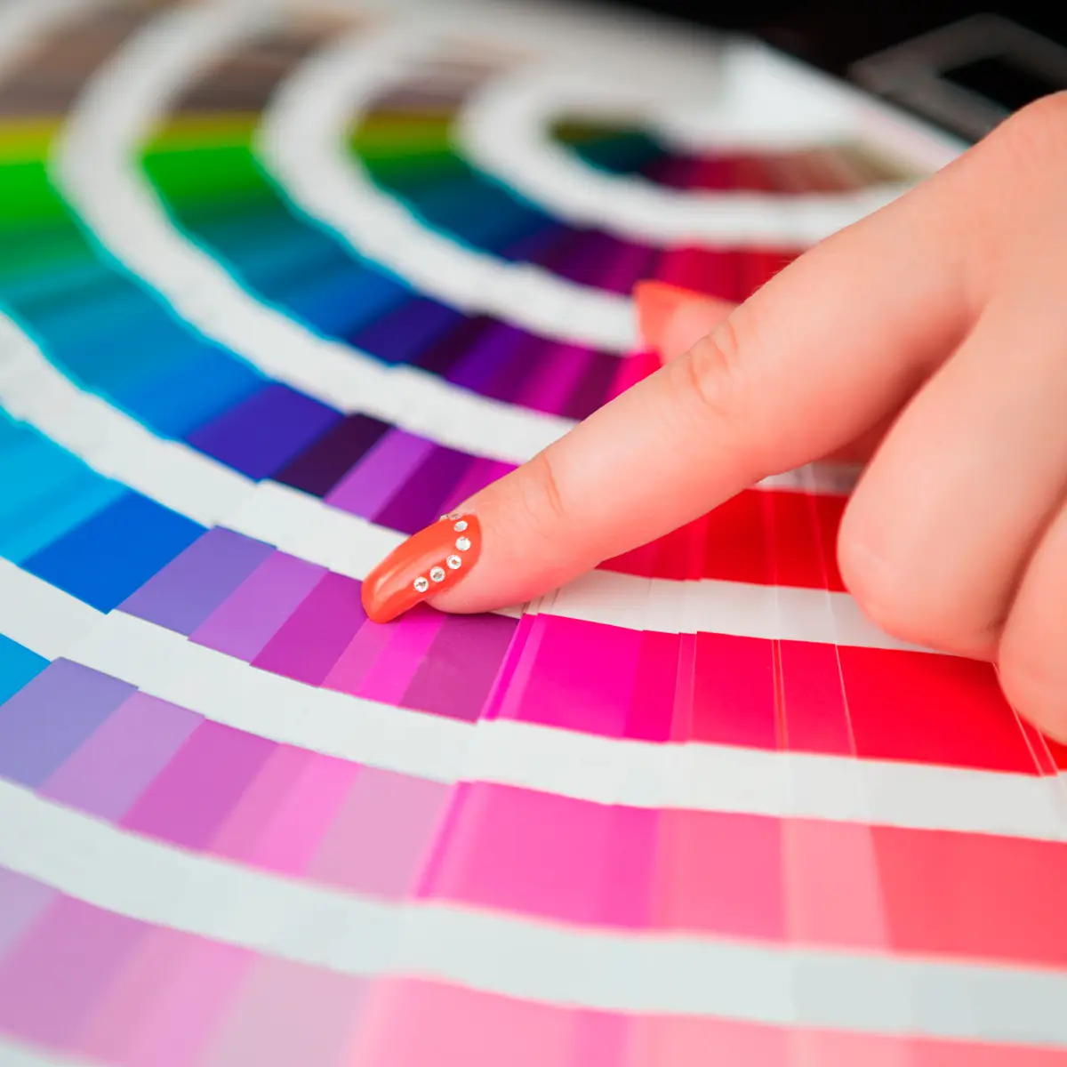
Why are colors so important?
Proper use of color will help shape and reinforce your message.
First, from a marketing perspective, the objective of a proposal is to sell something: a product, a service, a project, your worthiness for funding, etc. Although we like to believe we are logical in our decision making, the truth is that emotions play a significant factor. Colors help shape the emotional component of your message. The colors a reader sees immediately trigger a subliminal nervous system response and create a specific feeling.
Second, colors capture the reader's attention and set up a path for the reader's eye to follow. Our brains are not wired to immediately see and understand the words on a page. Our brains first see colors and shapes; the last thing our brains do is actually make sense of the words. This is why we use eye-catching visuals in our packaging. It's also why the first page of your proposal (the Title Page cover) should always be eye-catching. You get better results when you capture a reader's attention with color.
Third, after you have created a feeling and captured the reader's attention, you want to keep that attention. Proper use of color dramatically increases the reader's retention of information. Plain black text on a white background might look great to you as a writer focusing on the written word, but it won't cut it for a final professional presentation. That said, you also have to know when enough is enough. Use bold colors sparingly when you want to make a point that should be reinforced. Too much color will overload the page and your message will be lost.
You also need to consider the audience for your proposal. You don't want to be the person who lost a big client because you sent a high-energy red, orange and yellow design to a conservative investor. Or the one who sent a classic conservative grey design to a hip and trendy high-tech startup. You may not lose a deal just on the basis of your title page cover design and color scheme selection, but many times the difference between winning and losing a client lies in the fine details - and color and design selection are important fine details to consider.
Do you want to match your document's colors to your own logo and company colors? Or perhaps you want to match your proposal's colors to the company colors of the prospective client you are submitting a proposal to. Or maybe you want to match colors to an event or a holiday season.
Do you want a conservative look or a bold and exciting look? That will depend on your reading audience and your industry.
What if you are trying to add a visual element to sway someone emotionally? Which colors do you pick to be congruent with the message you are trying to impart?
In other words, how do you go about picking a color scheme?
 If color theory is too confusing for you, then go with blue. Blue is the most common color scheme used across the world. You really can't go wrong with blue.
 If you want to appear clean and conservative, go with blues and greys. For example, if you are responding to a government RFP, you won't get points for using bold and exciting colors and designs. However, you also don't want a completely plain introduction that leaves nothing for the eye to focus on, either, so choose a plain block design in a grey or grey/blue color scheme.
 If you want your proposal to seem bold and exciting, use reds and oranges. For example, if you are in a creative or high-energy field, make a strong statement with an edgy design in reds or oranges.
 If you are in an industry dealing with nature or natural elements, choose earth tones, aquatic colors, or other natural color schemes.
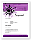 If you are in an industrial setting, consider bold, strong colors such as black paired with another intense color like blue, orange, green, or purple.
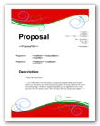 If you are gearing up for a holiday season, go with orange/black for Halloween, rich earth tones for Thanksgiving, jewel tones or pastels for Easter, red/green for Christmas.
 White stands for purity and cleanliness. When used in a document background, white serves as a neutral color (along with light shades of grey) in a design.
 Black represents authority, power, formality, and elegance. Use black to make a bold statement, especially when paired with other colors. Black combined with other deep colors such as purple can make a powerful impression.
 Blue means peace, tranquility, life, loyalty, knowledge, and security. Blues are often used to signal that an organization or message is conservative and dependable. Use blues for technology, personal services, and corporate situations.
 Purple has historically been used to represent luxury, sophistication, and royalty. Use purples for personal services and high-end luxury products and services.
 Green has many meanings, such as heath, nature, money and trustworthiness. Use greens if you are in a healthcare, environmental, or financial field.
 Red is generally used to convey meanings such as passion, love, excitement, action, speed, strength and leadership. Use reds if you are in a leadership, fast food, sports, or event planning field (it's especially good for weddings).
 Orange typically represents vibrancy and fun. Use oranges to imply a sense of action. Orange is not a color typically associated with conservative businesses.
 Yellow generally stands for warmth, imagination, inspiration and happiness. Use yellows to convey a friendly and inviting feeling.
 Brown has traditionally represented reliability and longevity. Use browns to show a sense of down-to-earth reliability.
For a one-two punch, double up colors with multiple meanings. A great example is a financial advisor who could choose both green and purple as their primary colors to instill a sense of wealth, trustworthiness, and sophistication. Or an organization might choose green and blue to convey a sense of wealth, trustworthiness, and dependability. Using green plus other earth tones could signal wealth, trustworthiness, and a "down to earth" sensibility.
These suggestions are based on typical Western cultures. If you work in an international field, be sure to research the meaning of the colors you choose in the context of the culture in which you are doing business. For example, as mentioned above, white is a neutral color in the West, with meanings of purity and cleanliness. It is typically used in title page cover designs as a neutral design element. In Eastern cultures, however, white can be the symbol of death. This might not be much of an issue for the background of a text document, but it could have serious negative implications if white is the primary color of your product design.
Proposal Kit gives you a wide variety of tens of thousands of Title Page design and color choices based on many common contemporary business colors - colors that apply to various seasons, and colors that have many emotional meanings. Proposal Kit gives you over a hundred color schemes to pick from for each Title Page Pack design.
This wide range of color schemes is applied to a wide variety of distinct designs. So not only can you pick an appropriate color scheme, you can also pick an appropriate design. We know that designs are also very personal and distinct to a business, and we offer plenty of choices.
Do you want a simple angular design, a flowing circular design, a complex conceptual design or a design with elements related to a specific industry? Proposal Kit has you covered. We bundle our Title Page designs into packages, so you can select the perfect design for your business. You get hundreds of ready-to-use designs for a fraction of the cost of hiring a graphic designer to create a single graphic background.
Whether you need a clean and conservative look, a light and airy look, or a bold and vibrant look, Proposal Kit has you covered. Because color schemes can be very personal and many companies need their collateral material to exactly match a specific color scheme, we can also customize our designs so you can deliver that perfect match.


 Cart
Cart


 Facebook
 YouTube
 Bluesky
 Search Site